
2024 Font Trends & Best Fonts to Use on Your Labels
This entry was posted on September 24, 2024 .
Picking the right font for your labels can be the difference between catching a shopper’s eye or blending in with the competition. Fonts can communicate a lot about your brand personality—whether you're selling luxury wine or playful snacks, the right font sets the tone before anyone even reads the label.
In this blog, we’ll share some of the 2024 font trends and tips on choosing the best fonts for your custom labels. Plus, we’ll show you some trending fonts for 2024 with room for images so you can see how they’ll look on your label.
And don’t worry, we’ve added a few pairing tips too, so your labels look as polished as possible.
Clean, Minimal Fonts: The Go-To for Modern Brands
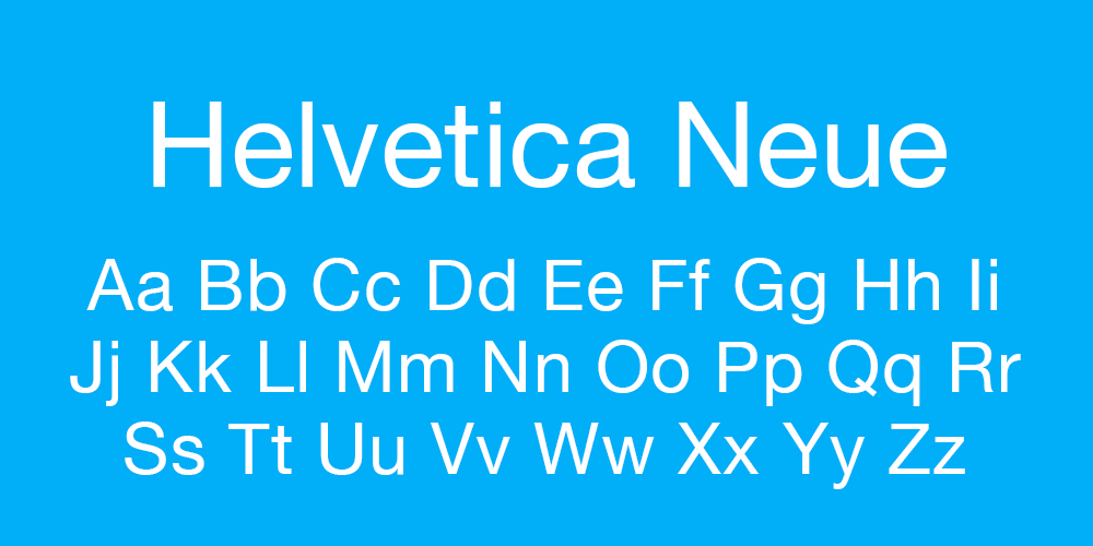
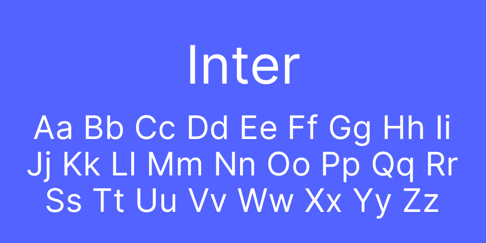
One of the biggest trends in 2024 is simplicity. Clean, minimal fonts have become a staple for brands that want to give off a fresh, modern vibe. These fonts are easy to read and give your labels a sleek, no-nonsense look. Think of them as the little black dress of fonts—timeless and versatile.
- Helvetica Neue
- Inter
- Roboto
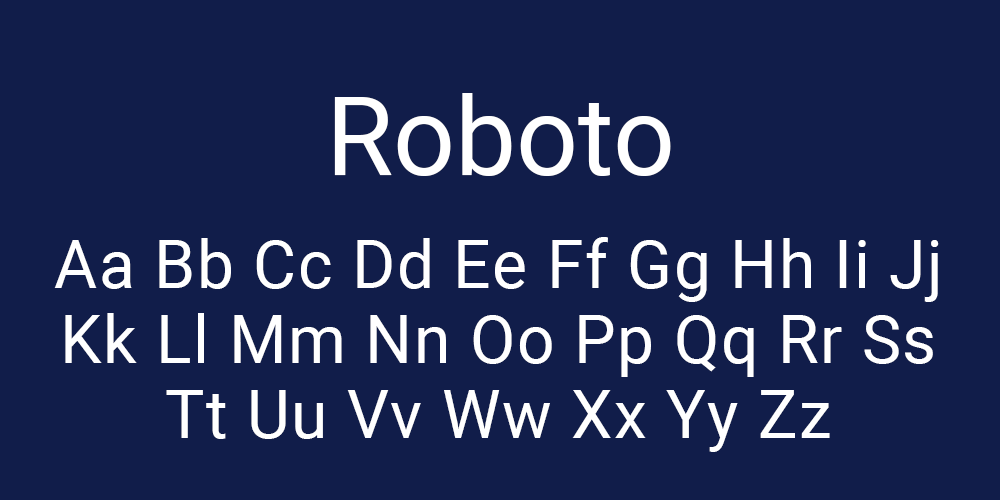
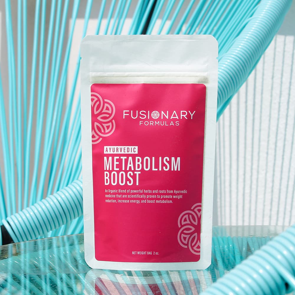
These sans-serif fonts work great across all types of products, from skincare to tech gadgets. Their simplicity makes them super adaptable, and they won’t steal the spotlight from your design. If you want your brand to say “clean and professional” without looking like it’s trying too hard, these are perfect.
Art Deco Fonts: Bold and Classy
Art Deco fonts are making a strong comeback this year, and we’re here for it. Bold and classy, these fonts work well for luxury items, high-end spirits, or even gourmet foods. They have a vintage flair that gives products a sense of nostalgia, but with a modern twist.
- Metropolis
- Decohead
- Peckham Press
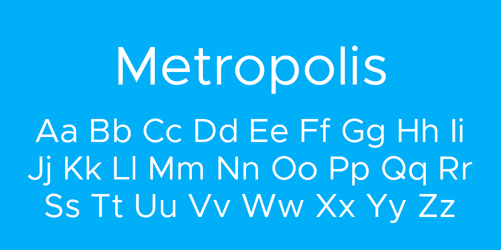
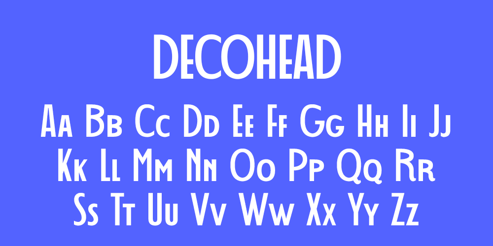
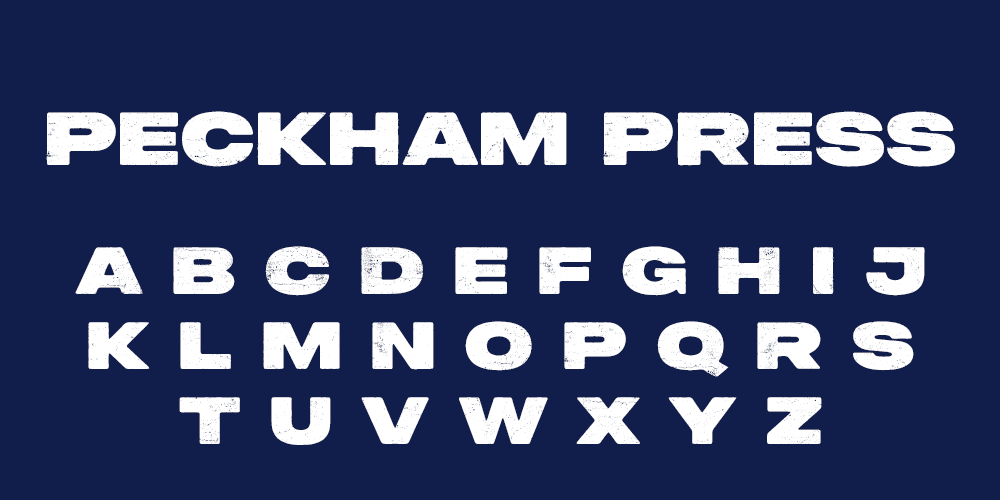
These fonts usually feature strong geometric lines and elegant curves, which give labels a sophisticated feel. They’re perfect for making your product look like it’s straight out of a 1920s cocktail bar or upscale boutique.
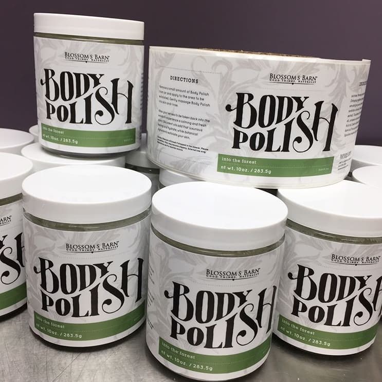
Playful Fonts for Quirky Brands
If your brand leans towards fun and approachable, playful fonts are the way to go. These fonts are all about creativity and personality, making them perfect for products aimed at a younger or more casual audience. They’re a great match for food packaging, craft items, or lifestyle products where you want to keep things light.
- Pacifico
- Lobster
- Fredoka One
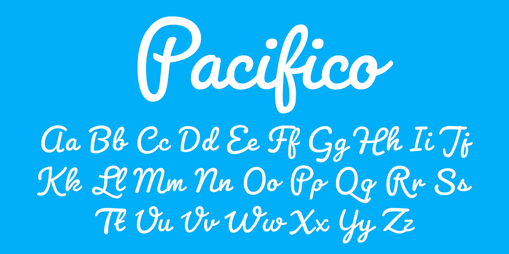
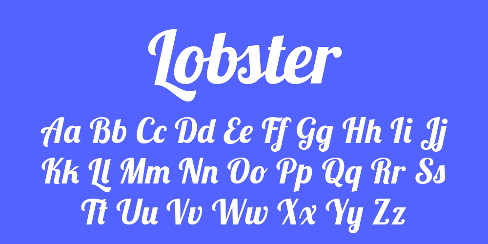
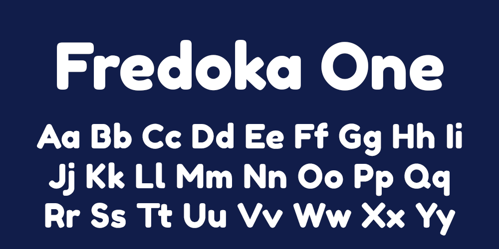
These fonts have a relaxed, friendly style that puts the customer at ease. They work well with bright colors and playful illustrations—great for brands that want to feel more casual and inviting. Just be careful not to overdo it; readability is still key!
Elegant Serif Fonts for a Timeless Appeal
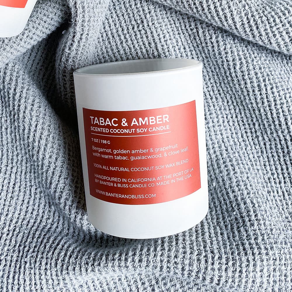
For brands that want to give off a more traditional or luxurious vibe, serif fonts are a go-to choice. These fonts have little "tails" or strokes at the end of each letter, adding a touch of elegance and timelessness to your labels. They work well for premium products like wine, luxury food items, and high-end skincare.
- Georgia
- Garamond
- Playfair Display
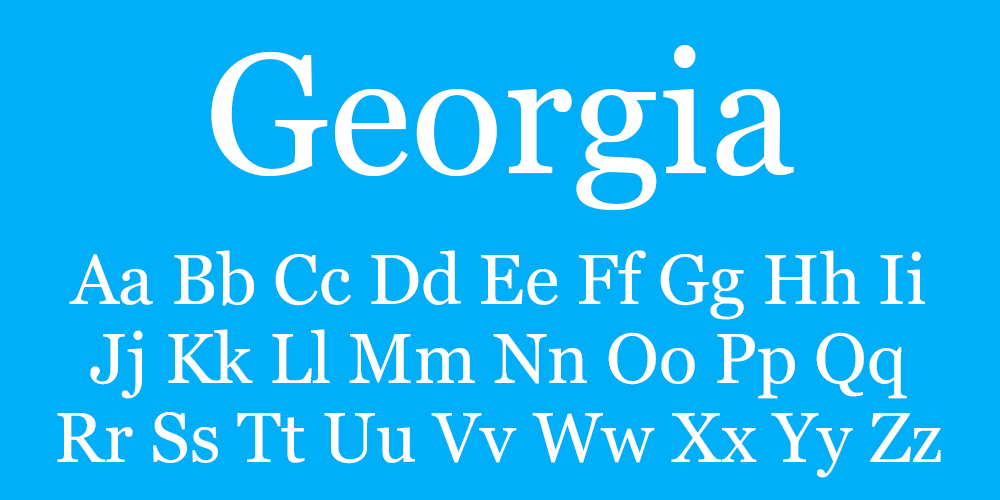
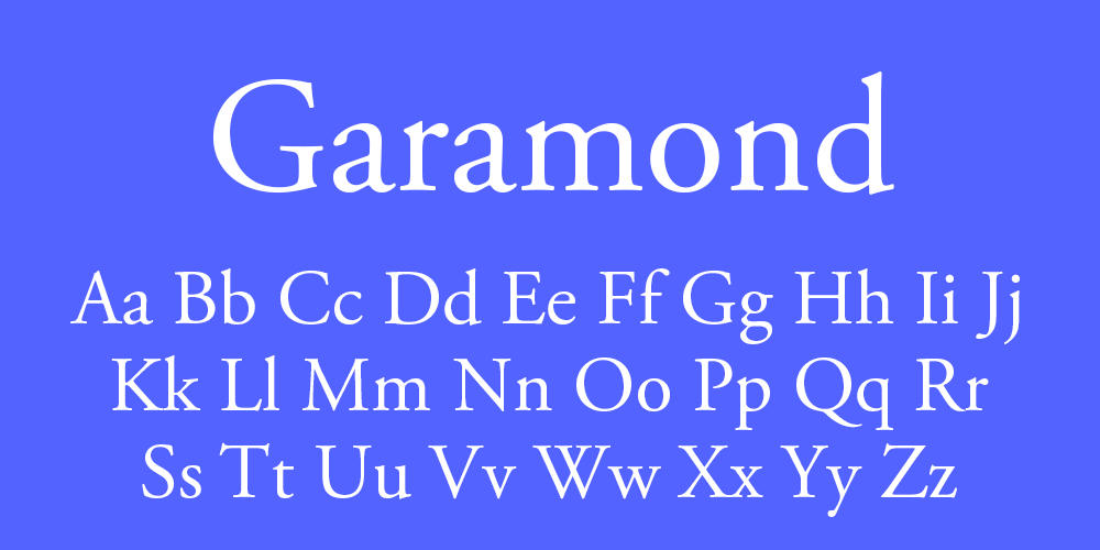
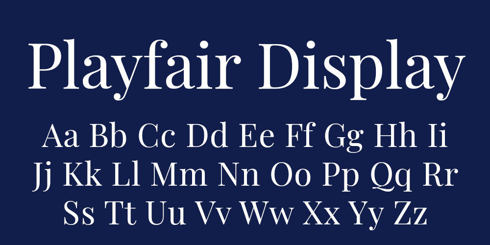
Serif fonts help communicate quality and heritage. They’re particularly effective for wine bottle labels and other products that aim to showcase craftsmanship. Serif fonts are also versatile, working well both as the main font or paired with simpler, sans-serif fonts for a balanced design.
Tips for Pairing Fonts on Your Labels
Pairing fonts can be tricky. The right combination can make your labels look polished and professional, while the wrong one might confuse or overwhelm your customers. Here’s how to get it right:
- Limit to Two Fonts: One for the product or brand name and another for the smaller details. Mixing more than two fonts can make your label look too busy and unorganized.
- Contrast is Key: If you’re using a bold font for the product name, choose a lighter, simpler font for the details. For example, pairing Playfair Display with Roboto gives a nice mix of elegance and modern simplicity.
- Stay On Brand: Your font choices should reflect your brand personality. Don’t go for a playful, whimsical font if your brand is more serious and formal.
Why Font Choice Matters in 2024
Choosing the right fonts is a subtle art, but it’s one that can have a huge impact on how your product is perceived. In 2024, the trends are all about balance—whether it’s minimalism, bold elegance, or quirky fun, your fonts should reflect your brand’s story.
No matter what industry you're in, the key is making sure your labels are easy to read, eye-catching, and aligned with your product’s personality. And if you’re ever in doubt, a good rule of thumb is: keep it clean, keep it clear, and don’t go overboard with font pairings.
Ready to create labels that stand out in 2024? Get a quote from Lightning Labels today and let’s bring your vision to life.
Related Products
-
 Custom Labels
-
Bath & Body Product Labels
-
Custom Candle Labels
-
E-Juice Vape Labels
-
Variable Label Printing
-
Health & Nutraceutical Product Labels
-
Custom Beverage Labels
-
Custom Bottle Labels
-
Custom Lip Balm Labels
-
Home & Garden Product Labels
-
Custom Warning & Safety Labels
-
Perfume Bottle Labels
-
Bumper Stickers
-
Custom Prop 65 Warning Labels
-
Extended Content Labels
-
Custom CBD Labels
-
Barcode Labels
-
QR Code Labels
-
Honey Jar Labels
-
Tea Labels
-
Custom Pet Product Labels
-
Custom Hemp Labels
-
Canning Labels
-
Custom Hand Sanitizer Labels
-
Custom Beer Labels
-
Sustainable Hemp Label Material
-
Blank Labels
-
Custom Stickers
 Custom Labels
  Custom Beverage Labels
  Custom Lip Balm Labels
  Custom Warning & Safety Labels
  Perfume Bottle Labels
  Bumper Stickers
  Custom Prop 65 Warning Labels
  Custom Stickers